3 min read
React image loader with a spinner
hey there, I’ve spent as usual a lot of time with React, Mantra and Meteor. While building a simple app I checked out the new Meteor standard for file handling Meteor-Files. It works great, I really recommend this awesome package. But that’s not what I want to show you. The app I’m working on loads pictures form the dropbox api. Downloading the pictures always takes a while. To make sure the user doesn’t get impatient the app is now displaying a spinner when the image is loading. I would to like to show you how I’ve built this image loader and spinner component.
First a preview of what we’ll build:
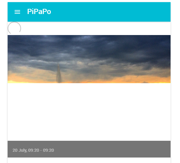
The spinner and the image in the screenshot are part of ImageLoader component. This components only purpose is to display either the image, a loading spinner or a error message.
The code should be straight forward.
image_loader.jsx
import React from 'react'
import Spinner from './spinner.jsx'

const style = {
  verticalAlign: 'top',
  maxWidth: '100%',
  minWidth: '100%',
  width: '100%'
}

class ImageLoader extends React.Component {

  constructor(props) {
    super(props)
    this.state = {
      fileStatus: props.src ? 'loading' : 'no image to load'
    }
  }

  setFileStatus(status) {
    this.setState({ fileStatus: status })
  }

  componentWillReceiveProps(nextProps){
    if(this.props.src != nextProps.src){
      this.setState({
        fileStatus: nextProps.src ? 'loading' : 'no image to load'
      })
    }
  }

  render() {
    return (
      <div>
        {(()=>{
          var status = {
            'loading': () => {
              return (<Spinner />)
            },
            'loaded': () => {
              return null
            },
            'failed to load': () => {
              return (<p>{this.state.fileStatus}</p>)
            },
            'no image to load': () => {
              return (<p>{this.state.fileStatus}</p>)
            },
          }
          return status[this.state.fileStatus]()
        })()}
        <img
          style={style}
          src={this.props.src}
          onLoad={this.setFileStatus.bind(this, 'loaded')}
          onError={this.setFileStatus.bind(this, 'failed to load')}
        />
      </div>
    )
  }
}

export default ImageLoader
The syntax, which is used to wrap the file status render, might be new to you. Nevertheless it’s a common patter I’ve copied from the facebook react blog.
Next is the spinner, which is inclued in the ImageLoader and which is basically a keyframe animated div box.
spinner.jsx
import React, { PropTypes } from 'react'
import {grey400} from 'material-ui/styles/colors'

class Spinner extends React.Component {

  constructor(props) {
    super(props)
  }

  render() {

    const style = {
      width: this.props.width,
      height: this.props.height,
      borderColor: this.props.borderColor
    }

    return (
      <div
        className='react-spinner'
        style={style}
      />
    )
  }
}

Spinner.propTypes = {
  width: PropTypes.string,
  height: PropTypes.string,
  borderColor: PropTypes.string
}

Spinner.defaultProps = {
  width: '40px',
  height: '40px',
  borderColor: grey400
}

export default Spinner
I’m not an expert in css animations, however, without the css code below the component is totally useless.
spinner.css
.react-spinner {
  width: 15px;
  height: 15px;
  border: 2px solid;
  border-bottom-color: transparent !important;
  border-radius: 50%;
  -webkit-animation: react-infinite-spinner linear 1.2s infinite;
  -moz-animation: react-infinite-spinner linear 1.2s infinite;
  -o-animation: react-infinite-spinner linear 1.2s infinite;
  animation: react-infinite-spinner linear 1.2s infinite;
}

@keyframes react-infinite-spinner {
  0% {
    transform: rotate(0);
  }
  25% {
    transform: rotate(90deg);
  }
  50% {
    transform: rotate(180deg);
  }
  100% {
    transform: rotate(360deg);
  }
}

@-webkit-keyframes react-infinite-spinner {
  0% {
    transform: rotate(0);
  }
  25% {
    transform: rotate(90deg);
  }
  50% {
    transform: rotate(180deg);
  }
  100% {
    transform: rotate(360deg);
  }
}

@-moz-keyframes react-infinite-spinner {
  0% {
    transform: rotate(0);
  }
  25% {
    transform: rotate(90deg);
  }
  50% {
    transform: rotate(180deg);
  }
  100% {
    transform: rotate(360deg);
  }
}

@-o-keyframes react-infinite-spinner {
  0% {
    transform: rotate(0);
  }
  25% {
    transform: rotate(90deg);
  }
  50% {
    transform: rotate(180deg);
  }
  100% {
    transform: rotate(360deg);
  }
}
I hope you liked my approach, let me know what you think in the comment section.
Categories: JavaScript developmentTags: react
Edit this page
Show statistic for this page