1 min read
Meteor and React: Bootstrap Modal
I would like to share my great experience I had with Meteor and React. This time I want to show how I’ve built a bootstrap modal component. There are already a lot of solutions out there, but none of them were suitable.
Here’s how you can get a neat bootstrap modal for your Meteor React project.
I assume you already have added the bootstrap, classnames and react package to your project.
Modal = React.createClass({
renderFooter(){
if(!this.props.footer){
return <div className="modal-footer">
<Button style="primary" onClick={this.props.onConfirm}>{this.props.confirmLabel}</Button>
<Button style="default" onClick={this.props.onCancel}>{this.props.cancelLabel}</Button>
</div>
}else{
return <div className="modal-footer">{this.props.footer}</div>
}
},
render() {
var modalClassName = classNames({
"modal": true,
"show-modal": this.props.showModal
});
return <div className={modalClassName}>
<div className="modal-dialog">
<div className="modal-content">
<div className="modal-header">
<Button className="close" onClick={this.props.onCancel} ariaLabel="Close"><span aria-hidden="true">×</span></Button>
<h4 className="modal-title">{this.props.title}</h4>
</div>
<div className="modal-body">
{this.props.children}
</div>
{this.renderFooter()}
</div>
</div>
</div>
}
});
The Button tag of course is another React component that you have to build yourself.
To toggle the visibility of the modal dialog simply add this css class.
.show-modal{
    display: block;
}
Here’s and excerpt of the necessary code to run the component:
YourComponent = React.createClass({

...

getInitialState(){
   return{
     showModal: false
   };
},
toggleModal(){
  this.setState({showModal: !this.state.showModal});
},
render(){
  <Modal
    showModal={this.state.showModal}
    title="Confirm"
    onCancel={this.toggleModal}
    cancelLabel="Cancel"
    onConfirm={this.deleteItem}
    confirmLabel="Delete"
  ><p>Please confirm the deletion of item: {this.data.item.label}</p></Modal>
}
...

});
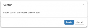
The final result:
Tags: bootstrap , css , jsx , meteor , react , twitter
Edit Page / Show Statistic