1 min read
Improve your next presentation with Less is More
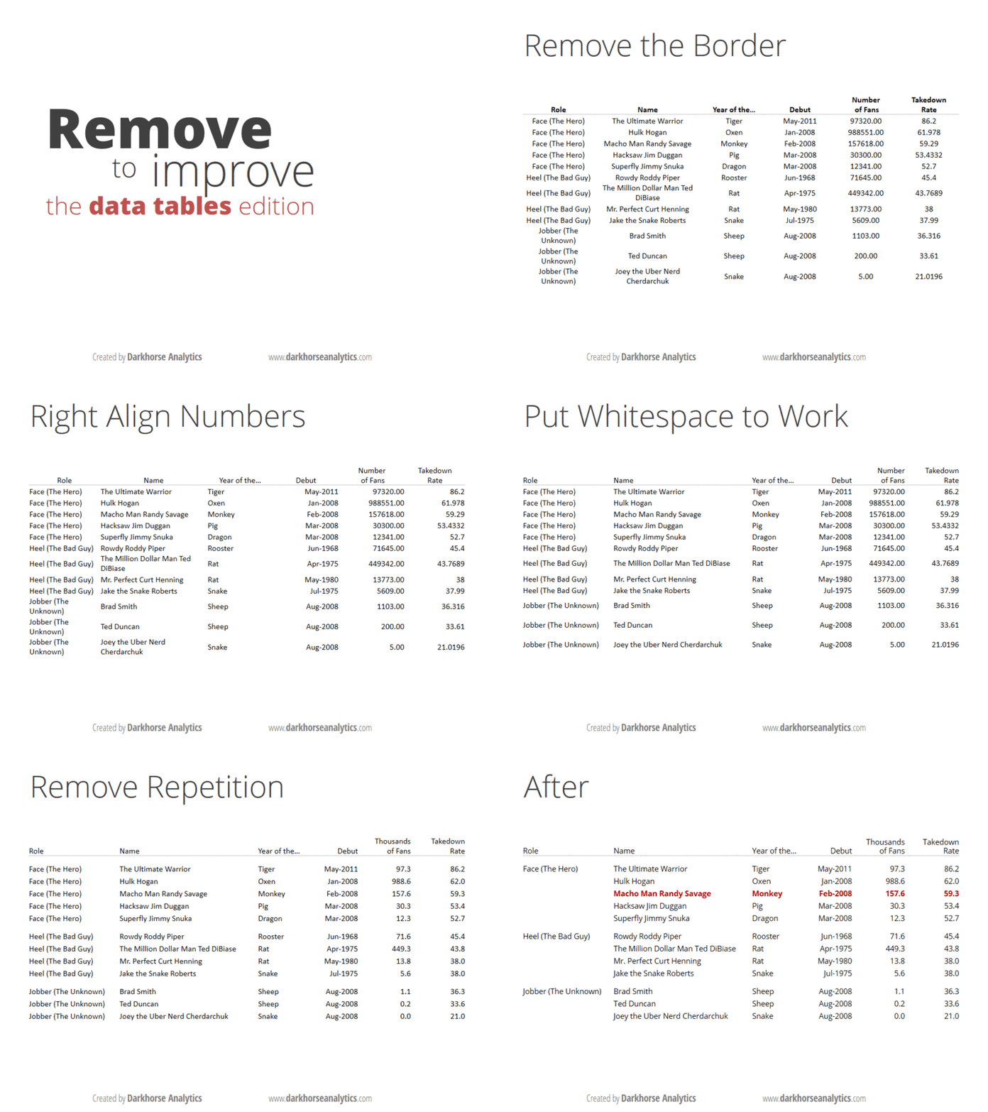
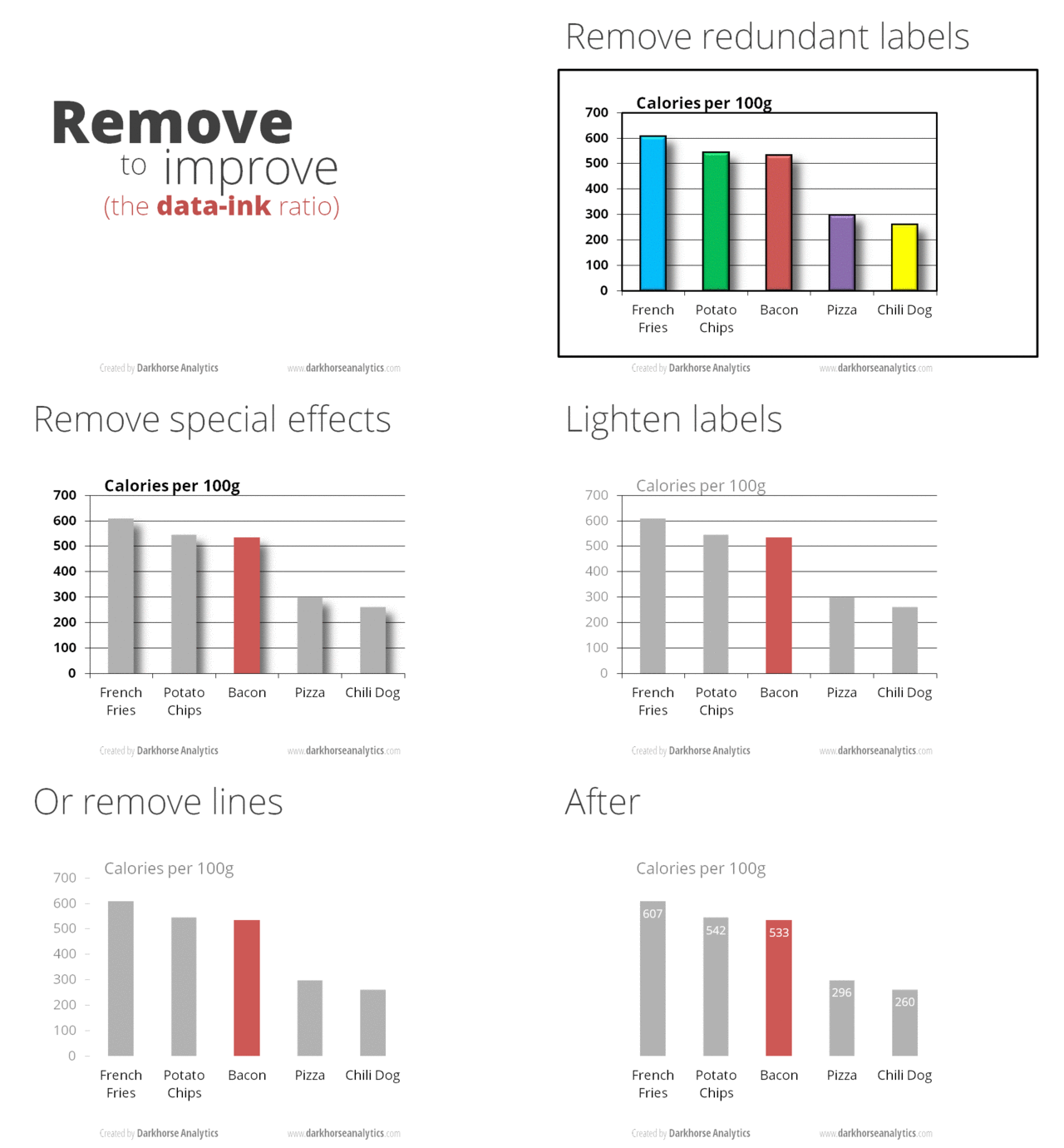
The less is more approach is a simple improvement strategy for your next presentation. By simplifying the design and removing unnecessary formatting of tables of diagrams, they will be more easy to read and understand.
The Darkhorse Analytics company has created some short animations about this strategy.
Categories: BlogTags: design , presentation , skills
Edit this page
Show statistic for this page

